


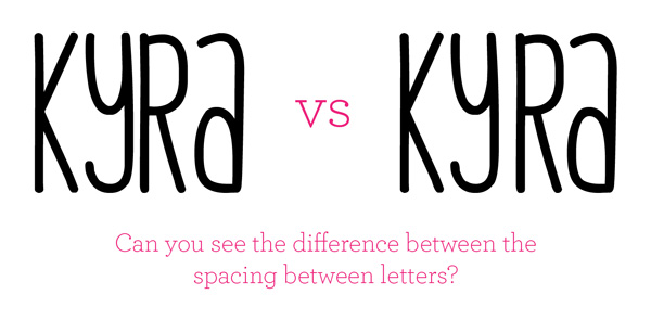
remember this post when i told you i would help you make
free fonts look better? well here is the thing that will help
the most. it's called kerning. (the adjustment of space
between two letters) sounds simple enough right??
it's subtle but will help your blog, brand, and your hand
designed card for your mom look better. promise. :)
If it’s hard to see, try flipping the type
upside down so you can pay attention to
the white space between letters instead
of reading the word.


The goal is to equalize the appearance
of white space between the letters visually.
Letters behave differently depending on the
combination. Visually spacing the letters is kind
of like a family. Letters with strong slants
(ex. A and W) are like the older brother who
push the younger siblings away, while
two lowercase L’s (ll) are like younger sisters
who are obnoxiously clingy. The family needs
to find the balance. It won’t be a perfect calculated
amount, but it will be a beautiful loving family where
older brother learns to love his little sister and little
sister learns to give his brother some space.
too much of a stretch? probably. moving on.. :)

hope you are totally stoked to make all your
free fonts look pretty now. :)
oh and your free type download..


1 comments:
great info and another great font! thanks!
Post a Comment